Svelte Transition
|Updated:
28 Aug 2024
|62 Stars
Svelte Transition Component
Categories
Overview
The svelte-transition component is a versatile tool designed to enhance your web applications with smooth CSS class-based transitions, making it particularly suitable for projects utilizing TailwindCSS. With its lightweight footprint of around 3Kb (1.5Kb gzipped), this component streamlines the task of adding transitions to your Svelte components, allowing developers to create a more dynamic user experience.
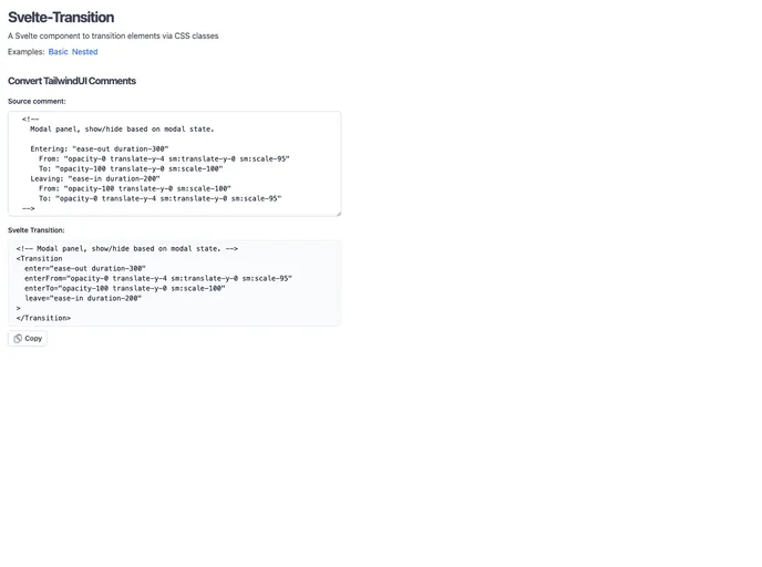
This transition component is loosely modeled on the HeadlessUI Transition, enabling straightforward integration into existing Svelte projects. Whether you’re looking to smoothly appear or disappear elements or coordinate transitions with child components, svelte-transition provides a simple and effective solution.
Features
- Easy Integration: Just import the component and wrap your HTML elements with the
<Transition>
tag to control visibility with simple flags. - Optimized Performance: At just about 3Kb in size, it maintains a lightweight presence in your application without sacrificing functionality.
- Automatic Child Coordination: Transitions automatically wait for child components to finish before unmounting, ensuring seamless animations.
- Event Handling: Built-in events such as
before-enter
and after-leave
allow for precise control and notifications during transitions. - TailwindCSS Compatibility: Specifically designed to work well with TailwindCSS, making it easier to apply your preferred styling.
- Custom Appear and Unmount Options: Customize the transitional behavior on initial mounting and control whether elements are removed from the DOM or just hidden.
- Simplified Syntax: Omitting the leave transition if it mirrors the enter transition simplifies implementation, saving bytes and reducing redundancy.
- Handy Conversion Tool: If migrating from TailwindUI, a built-in converter can help rapidly transform comments into
<Transition>
markup.