Web components for fast user interfaces.
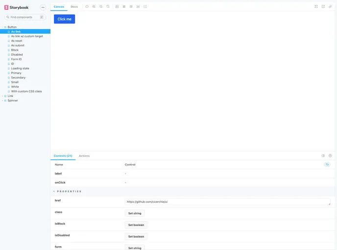
Cicerchie UI is a set of web components that can be used to build fast user interfaces. It is currently in an experimental phase and is not thoroughly tested or reviewed. Users are advised to use it at their own risk and ensure it meets their specific requirements.
To get started with Cicerchie UI, follow these steps:
npm install -D @cicerchie/ui
tailwind.config.js file:// code snippet here
Please note that in the future, an optional version of each component containing the necessary CSS will be made available.
// code snippet here
If you are using a bundler plugin like rollup-plugin-svelte or svelte-loader, you can import the components’ source code directly in your Svelte 3 project.
Components can be imported using plain JavaScript modules or UMD.
Web component support is coming soon.
Cicerchie UI is a collection of web components that can be used to build fast user interfaces. It is currently an experimental project, so users are advised to use it with caution. The installation process involves installing the package via npm and adding TailwindCSS manually. There are different ways to consume the components depending on the project type. The project is built with Svelte 3 and TailwindCSS and offers various features such as latest release information, license details, Github repository dependents, and more.