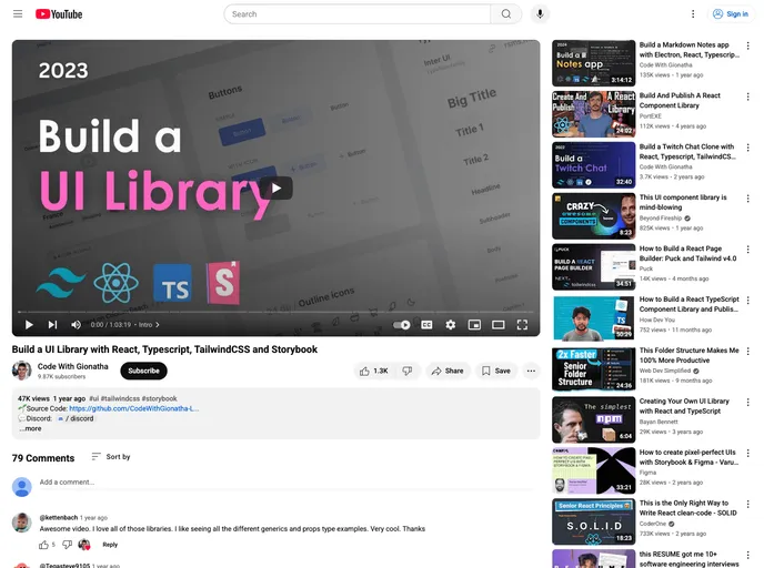
A basic typesafe UI Library built on top of React, Typescript, TailwindCSS and Storybook
The React UI Library is an innovative solution that combines the power of React, TypeScript, and TailwindCSS to deliver a typesafe and responsive user interface experience. With a strong emphasis on modern design and robust functionality, this library is designed to streamline the development process, making it easier for developers to create stunning applications efficiently.
One of the standout features of this library is the integration with Storybook, which serves as a dynamic showcase for all implemented components. This not only allows developers to visualize their components in action but also supports a collaborative environment for creativity and feedback. Overall, the React UI Library aims to empower developers with the tools they need to build high-quality UI components rapidly.