Custom push notification (Toast) implementation under React + stayed by TailwindCSS.
The custom toast component harnesses the power of React hooks and the React Context API, offering a seamless way to implement notifications in your applications. Styled with the TailwindCSS framework, this component is designed to be both functional and aesthetically pleasing. It allows for real-time user notifications, with the added convenience of automatic removal after a specified duration, making it an essential tool for enhancing user experience in your projects.
Whether you’re looking to provide alerts for errors, warnings, or success messages, this toast component makes it easy to push notifications to the screen and offers the flexibility to customize the content. As part of a UI library, it is crafted to be straightforward and adaptable for various use cases.
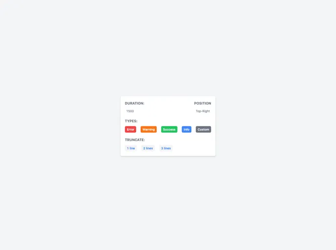
Multiple Notification Types: Includes predefined types such as info, error, warning, and success, allowing for clear communication with users.
Customizable Content: Pass any custom React component as the toast body for tailored notifications that suit your application’s needs.
User-Friendly Configuration: Easy setup through cloning the repo and running the demo, making it accessible even for developers who are not deeply familiar with React.
Responsive Design: Built with responsiveness in mind, ensuring notifications display correctly across different device sizes and browsers.
Positioning Options: Toasts can be displayed in various positions on the screen, providing flexibility in how notifications are presented.
Auto Removal Feature: Notifications are programmed to auto-dismiss after a set time, streamlining user interaction without manual intervention.
Enhanced Developer Experience: Utilizes hooks and context, making it easy for developers to access and manage toast actions throughout their applications.