DB UX Design System monorepo - Provides Design Tokens and components for Web UIs
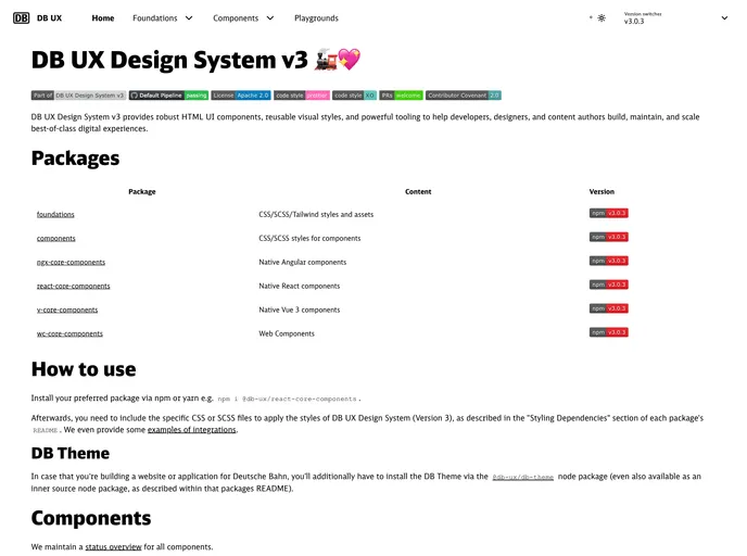
The DB UX Design System v3 is an impressive toolkit designed for developers, designers, and content authors aiming to craft exceptional digital experiences. It provides a comprehensive framework consisting of reusable UI components and visual styles that enhance functionality while maintaining a consistent user experience. With its adherence to best practices such as semantic HTML and ARIA roles, this design system ensures accessibility and usability across all interfaces.
This version marks a significant advancement by offering a variety of packages, making it versatile for different frameworks like Angular, React, and Vue. Whether you’re building a new project or revamping an existing one, DB UX Design System v3 aids in maintaining design consistency and speeding up the development process.
Robust Component Library: Offers a rich set of HTML UI components that can be easily integrated into various applications, ensuring consistency and enhancing usability.
Multiple Framework Support: Includes native components for Angular, React, and Vue, allowing developers to choose the best tools for their projects without compromising on design.
CSS/SCSS/Tailwind Compatibility: Provides styles across different formats, making it adaptable to your project’s existing architecture and preferences.
DB Theme Integration: Specifically designed for applications related to Deutsche Bahn, ensuring that branding and design requirements are met effortlessly.
Accessibility-Focused Design: Leverages semantic HTML and ARIA roles to enforce accessibility best practices, making it easier for all users to navigate and interact.
Version Control with NPM Packages: Each component and style can be managed via npm, promoting efficient updates and maintenance.
Quality Assurance Processes: The system undergoes regular quality checks in collaboration with expert teams, ensuring that the components are reliable and up to standard.
Comprehensive Documentation: Detailed README files and styling dependencies guide users through the installation and integration processes, facilitating a smooth setup.