A Monthpicker & Monthrangepicker component based on shadcn/ui
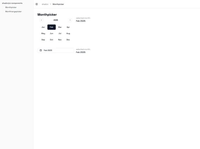
The Monthpicker and Monthrangepicker components are versatile tools designed specifically for shadcn-ui, utilizing Radix and Tailwind CSS. These components offer developers a fully customizable way to allow users to select either a single month or a range of months, seamlessly integrating with any project that employs the shadcn-ui framework. Their flexibility and user-friendly interface make them an ideal choice for applications requiring date selection features.
Not only do these components stand out for their aesthetic adaptability thanks to Tailwind CSS, but they also present various functionalities that elevate the user experience. Whether you’re building a calendar interface or just need a quick month selection feature, these components promise to enhance your application’s overall usability.
Customizable appearance: Tailwind CSS integration allows for an easy and extensive styling process, matching your application’s branding effortlessly.
Single and range selection: Choose between the Monthpicker for selecting a single month or the Monthrangepicker for selecting a start and end month.
Interactive callbacks: Supports functions like onMonthSelect and onYearForward to enhance interactivity, allowing you to tailor responses to user actions perfectly.
Date limitations: With the minDate and maxDate properties, you can restrict user selections to a specific range, ensuring better data handling and user guidance.
Customizable labels: The component allows for function-based styling of year and month labels, which can be tailored to meet any design requirements or user accessibility needs.
Non-selectable months: Easily disable specific months using the disabledDates prop, providing clarity on which options are available to users.
Integration with Popover: For a cleaner interface, these components can optionally be wrapped in a Popover, enhancing the ergonomic design of your application.
Responsive design: Built with modern web standards, they ensure consistent functionality and appearance across a wide range of devices and screen sizes.