A UI component library built with Phlex, Tailwindcss, and daisyUI
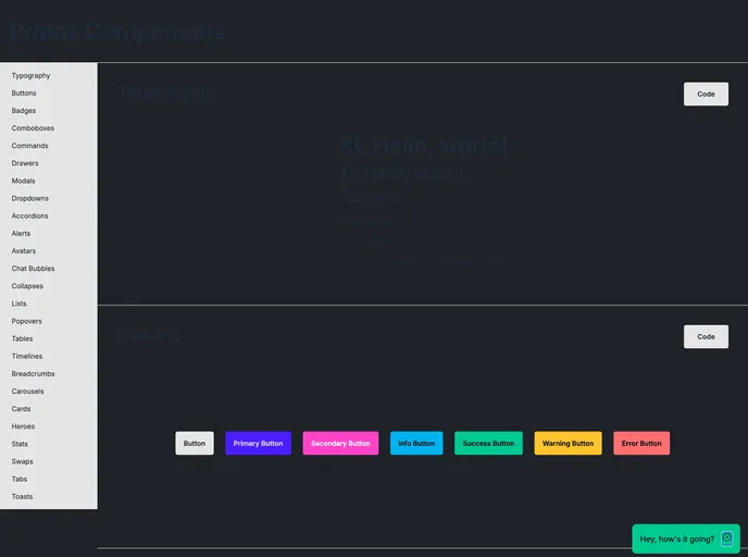
The Protos UI component library for Phlex utilizes tailwindcss and daisyUI. It offers a full list of components and provides a customizable approach to styling and theme management. By avoiding Phlex::DeferredRender, Protos allows for easy reordering of components within applications.
To install the Protos UI component library for Phlex, follow these steps:
git clone https://github.com/protos/protos-ui.git
cd protos-ui
npm install
The Protos UI component library offers a comprehensive solution for integrating UI components into Phlex applications. By leveraging tailwindcss, daisyUI, and tippy.js, Protos provides a modern and customizable approach to building UI elements. With ergonomic conventions like Slots and themes, Attrs and default attrs, and Params and options, developers can easily style and manage components to fit their application needs. Overall, Protos aims to strike a balance between pre-defined styles and customization options for a seamless UI development experience.