An opinionated React & TailwindCSS-based UI kit.
Metal UI is a specialized set of UI components designed for React applications, crafted by the Latitude.sh team. As it transitions into maintenance mode, the focus is on minor updates rather than introducing new features. This library integrates closely with TailwindCSS, reflecting the Latitude.sh brand identity while providing flexibility for developers through customization options. Ideal for desktop applications, Metal UI prioritizes a cohesive aesthetic over responsive design.
To effectively use Metal UI, developers must have TailwindCSS installed, as it does not export Tailwind styles directly. This makes it essential to follow specific setup steps to ensure seamless integration within projects, especially for those with existing Tailwind configurations.
Customizable Components: While Metal UI is opinionated in design, most components offer some level of customization to fit various project needs.
TailwindCSS Integration: Requires TailwindCSS to be set up in your project, as it does not export the styles needed independently.
Twin.macro Support: The library is transitioning to fully utilize twin.macro, which will eventually allow users to eliminate the Tailwind dependency when using Metal UI.
Default Font Setting: Sets Inter as the default font but does not include it in the package to keep downloads lightweight for users who do not utilize it.
GlobalStyles Requirement: Metal UI requires a GlobalStyles component to be properly set up, ensuring consistent styling across the application.
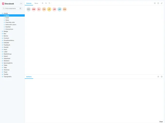
Developing Components with Storybook: Comes with a built-in Storybook feature, allowing developers to visualize and test components during development.
Focused on Desktop Usage: The components are primarily designed for desktop applications, which may limit their responsiveness but enhance their functionality for intended use cases.