A Simple But beautiful Component Library for Tailwind CSS using React and Typescript
Overview
TailBit is an elegant component library designed for developers who appreciate simplicity and beauty in their projects. Built with Tailwind CSS, React, and TypeScript, it offers a modern approach to UI design that is both flexible and customizable. The library is geared towards those looking to enhance their web applications with a set of intuitive components while maintaining a clean aesthetic.
As an evolving project, TailBit is still in its early stages, currently not production-ready, but it presents a promising selection of components, particularly focusing on buttons. With ongoing contributions and improvements, it aims to grow into a robust resource for developers.
Features
- Simple Button: TailBit offers an easy-to-use button component that can be dropped into any project, enhancing user interaction without complexity.
- Custom Design Options: Users can customize buttons to fit their design needs, ensuring every element aligns with their application’s aesthetic.
- Icon Support: The button component includes support for Font Awesome icons, allowing for quick addition of visual elements to enhance functionality.
- Outline Style: Offer an outlined version of buttons, providing an alternative visual style for buttons to suit different design preferences.
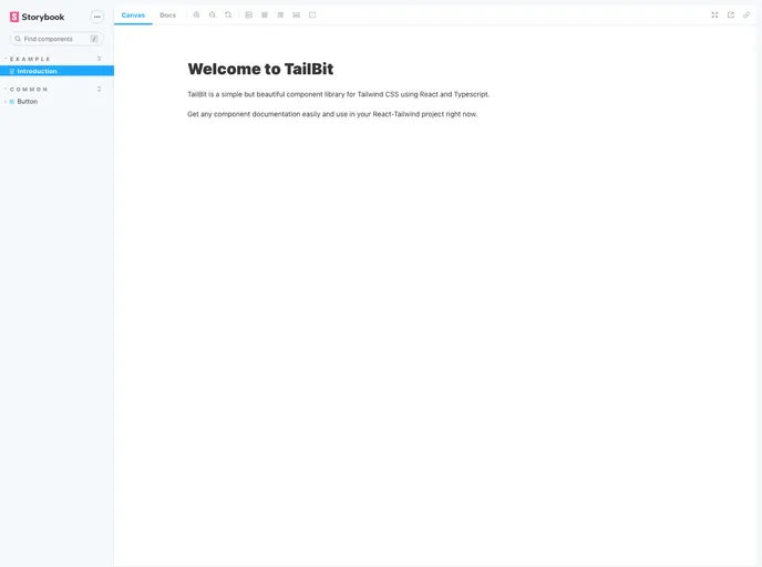
- Storybook Documentation: Comprehensive documentation through Storybook, making it easy for developers to explore components and examples in an organized manner.
- Open Contributions: The library welcomes contributions, making it a community-driven project where developers can add features or report bugs directly.
- Active Changelog: An accessible changelog that keeps users informed about the latest updates and fixes, enhancing usability and reliability.