Origin UI - Svelte represents an innovative approach to building user interfaces by harnessing the power of Svelte, a modern JavaScript framework. This fork of the original Origin UI project aims to streamline the UI development process with a collection of copy-and-paste components. Although it’s a work in progress, the potential for efficient application development is evident, especially for those already familiar with Svelte.
The framework is tailored for developers looking to expedite UI creation while maintaining design consistency. Even though certain libraries are yet to be available, the emphasis on modular components and clear guidelines promises a robust and flexible environment for building applications.
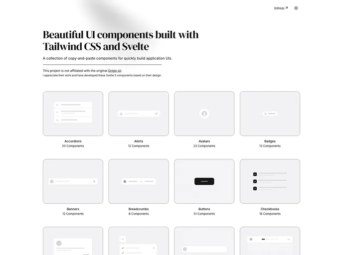
Svelte Integration: Built specifically for Svelte, allowing developers to leverage its reactive features and succinct syntax.
Copy-and-Paste Components: Quick utilization of pre-made components helps accelerate the development process and ensures design uniformity.
Component Registry System: An automated system that connects components to routes, ensuring type safety and enhancing the organization of resources.
Dependency Management: Includes a clear overview of required dependencies, enabling smoother integration and setup for the toolbox.
CSS Variables: Streamlined styling capabilities that are compatible with Tailwind CSS, facilitating easier customization without rewriting styles.
Community-Driven Contributions: Encourages developer participation, allowing the community to extend and improve the library with new features or components.
Preview Functionality: Local preview capabilities enable developers to see components in action before integration, which aids in the development cycle.
Support for Dynamic Routing: Uses SvelteKit param matchers for validation, making it easier to create dynamic web applications without sacrificing type safety.