A set of error page templates built with TailwindCSS for Ruby on Rails apps.
Overview:
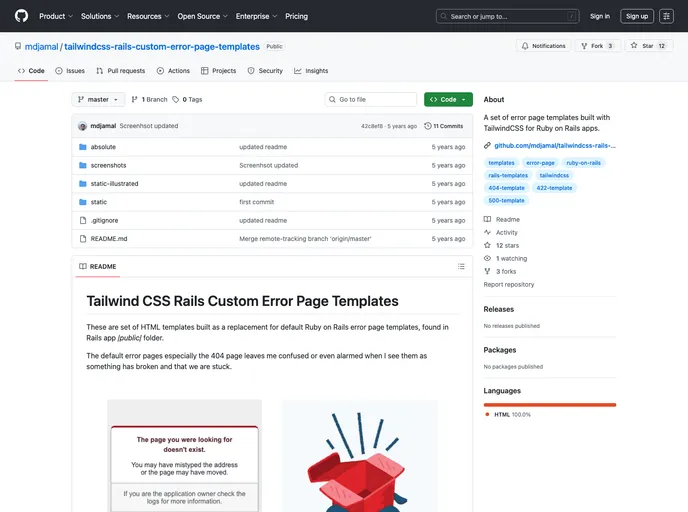
If you’ve ever encountered a default error page in a Ruby on Rails application, you know how frustrating and confusing they can be. The generic 404, 422, and 500 error pages often leave users more alarmed than informed. However, thanks to Tailwind CSS Rails Custom Error Page Templates, you can upgrade those bland messages into beautiful, user-friendly designs. These HTML templates are crafted not only for functionality but also for visual appeal, incorporating stunning illustrations by Ouch.pics and a modern aesthetic using Tailwind CSS.
Say goodbye to those jarring default error messages. With these custom templates, you can provide a seamless and engaging experience for users even when things go wrong. These templates are designed to be simple, customizable, and easily integrated into your Rails application, ensuring that you maintain a polished look that reflects your brand.
Features:
- Variety of Templates: Includes beautifully designed templates for 404, 422, and 500 error pages, ensuring you have options for different scenarios.
- Tailwind CSS Integration: Built with Tailwind CSS, allowing for easy customization and a responsive design that looks great on all devices.
- Illustrated Variants: Offers a Static-Illustrated option that replaces bland error codes with engaging illustrations, enhancing user experience.
- Three Layout Styles: Choose from Static, Static-Illustrated, or Absolute layouts to best fit your design aesthetic and project requirements.
- Open-Source License: Available under the MIT License, which allows for flexibility in modification and use without restrictions.
- Easy Implementation: Simply copy and replace the existing error pages in your Rails app’s /public/ folder for quick setup.
- Responsive Design: The Absolute layout caters to different screen sizes, providing an optimal viewing experience whether users are on a phone or a computer.