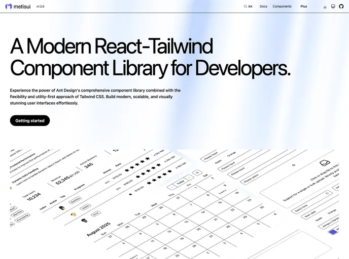
Overview
The React component library styled with Tailwind CSS offers a fresh and modern approach to building user interfaces, drawing inspiration from the renowned Ant Design. This library focuses on providing developers with reusable components that can easily be customized, significantly speeding up the development process while maintaining a consistent visual representation across applications.
With a modern tech stack that utilizes React, Tailwind CSS, and TypeScript, this library not only emphasizes functionality but also ensures flexibility in styling. The intuitive design and comprehensive documentation make it an excellent choice for developers looking to enhance their projects.
Features
- Reusable Component Logic: Built on Ant Design’s proven interaction patterns, ensuring users enjoy a consistent experience across different components.
- Flexible Styling: Tailwind CSS powers full customization, allowing developers to easily override default styles to match their design requirements.
- Modern Tech Stack: Utilizes the latest technologies including React and TypeScript, making it a robust choice for contemporary web applications.
- Documentation-Driven Development: Enhanced with example-driven documentation, facilitating rapid development and streamlining debugging processes.
- Easy Installation: Quick installation via npm or pnpm ensures developers can start using it in their projects without hassle.
- Community Contributions: An open-source approach with welcome contributions, encouraging a collaborative development environment.
- MIT License: Provides a permissive and flexible licensing structure for usage in personal and commercial projects.