Angular UI Kit
The Angular UI Kit by ng.guide presents an exciting opportunity for Angular developers to utilize a modern, modular component library that adheres to Material Design principles. Unlike traditional options such as Angular Material, this UI Kit is crafted from the ground up with a focus on transparency, customizability, and practical learning experiences. As this library is still a work in progress, developers have the chance to see it evolve, with components being built in public as part of an engaging educational course.
What sets this UI Kit apart is not just its thoughtful design but its commitment to providing reusable components alongside a comprehensive educational reference. Whether you’re looking to enhance your projects or deepen your understanding of Angular library development, the Angular UI Kit serves as a valuable resource for both learning and practical application.
Reusable Angular components: Each component is designed for easy reusability, streamlining the development process for various projects.
Built with Angular CLI & Nx: Leveraging industry-standard tools, this library ensures a robust development experience.
ng-packagr & APF-compatible: Seamless integration and compatibility with Angular Package Format enhances usability for developers.
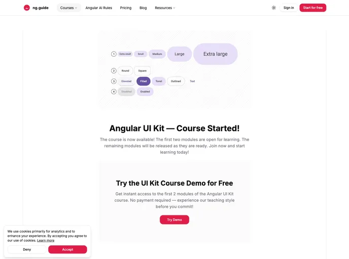
Material Design-inspired: While inspired by Material Design, this kit does not rely on Angular Material, offering unique implementation flexibility.
Customizable themes & tokens: Users can easily adjust themes and design tokens to fit specific brand aesthetics and project needs.
Tested with Vitest: Each component undergoes rigorous testing, ensuring quality and reliability in production environments.
Ongoing course development: As components are being developed, learners and contributors can engage directly with the project, making it an interactive learning experience.
Comprehensive course roadmap: The development phases of the toolkit are transparently outlined, helping users align their efforts with the project’s progress and future enhancements.