Overview
UI-Svelte is an innovative and opinionated UI component library specifically designed for Svelte, crafted to enhance the development experience while delivering stunning UI elements. Currently in active development and beta, this library boasts a range of features that prioritize usability and efficiency, promising developers a robust toolkit for their Svelte applications.
As UI-Svelte progresses, users can expect some changes in functionality; however, this also means developers are continuously improving and refining the library. Whether you’re building a new project or enhancing an existing one, UI-Svelte aims to provide the components you need for a seamless user interface.
Features
- Opinionated Design: UI-Svelte adopts a highly opinionated design approach, ensuring consistent and attractive UI components that enhance the aesthetic appeal of applications.
- Active Development: The library is under active development, meaning it is frequently updated with new features and improvements based on user feedback.
- Beta Version: As a beta library, UI-Svelte is in a testing phase, allowing users the chance to experiment with cutting-edge components and provide valuable input.
- Svelte Integration: Specifically built for Svelte, UI-Svelte seamlessly integrates with the framework, making it easy to implement and use in existing projects.
- Peer Dependencies: Users are advised to install the necessary peer dependencies, providing a streamlined setup experience for utilizing the library’s components.
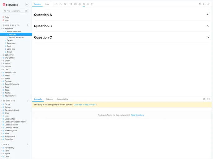
- Storybook Documentation: While still developing, UI-Svelte offers Storybook documentation, allowing developers to visualize components and understand their functionality effectively.