Blog Template built with TailwindCSS features accessible, mobile-responsive components
Overview
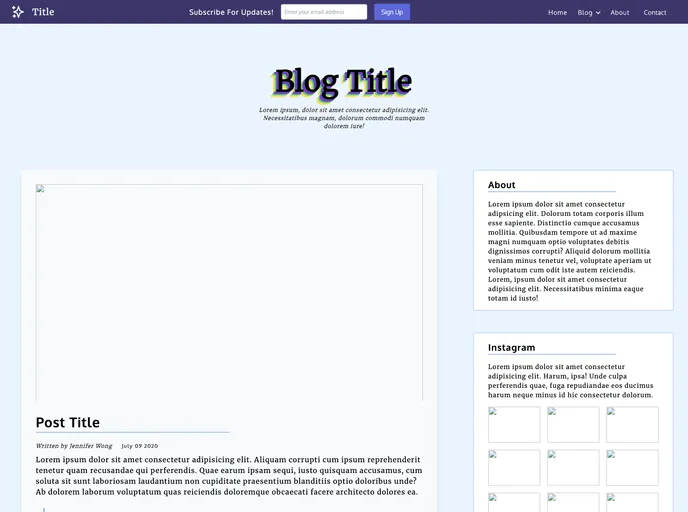
The TailwindCSS template I recently came across offers a sleek, mobile-responsive design that’s perfect for anyone looking to create an engaging online presence. With an emphasis on aesthetics and usability, this template is well-suited for bloggers and businesses alike. Its modern layout and user-friendly features make it easy to highlight content while also navigating the site effortlessly.
Features
- Mobile Responsive Design: Automatically adjusts to various screen sizes, ensuring a smooth user experience on mobile devices and tablets.
- Featured Post with Sidebar: Showcases top content prominently while providing additional information in the sidebar, including an About section and an Instagram feed.
- Card Grid Layout for Recent Posts: Displays recent blog posts in a visually appealing card format, making them easy to scan and access.
- Axe Beta Compliance: Passes accessibility tests, ensuring that the design is usable by individuals with disabilities, promoting inclusivity.
- Lighthouse Performance: Achieves high performance ratings, optimizing load times and enhancing user engagement.