Product Analysis: PureBlazor Components
Overview
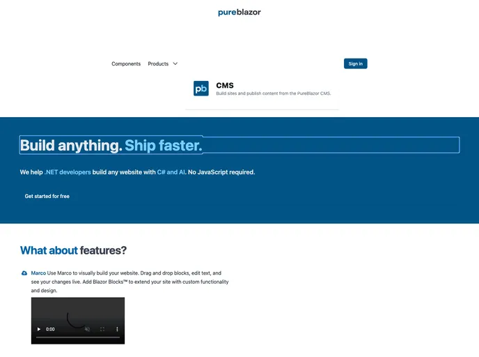
PureBlazor Components is a collection of Blazor components built specifically for the PureBlazor CMS. It aims to provide a set of robust, high-performance, and easy-to-use components to enhance the development experience of PureBlazor CMS users.
Features
- Performance: PureBlazor Components have been optimized for performance, ensuring fast and responsive user interfaces.
- Simplicity: The components have been designed with simplicity in mind, making it easy for developers to integrate them into their projects.
- General: The General category of components includes Alert, Button, Card, Charts, Dialog, Dropdown, Flyout, Tab, Toggle, Table, and Navigation.
- Inputs: The Inputs category of components includes Field, Upload, Checkbox, Radio, Rating, Select, Toggle, DatePicker, and TimePicker.
Installation
To install PureBlazor Components in your project, follow these steps:
- Open your project in Visual Studio or your preferred code editor.
- Navigate to the terminal or command prompt within the project directory.
- Run the following command to install PureBlazor Components from NuGet:
dotnet add package PureBlazor.Components
- Once the installation is complete, you can start using the PureBlazor Components in your Blazor pages by importing the necessary namespaces and adding the component tags to your markup.
@using PureBlazor.Components.General
@using PureBlazor.Components.Inputs

...

<Alert />
<Button />
<Card />
...
- Customize the components and their properties as per your requirements.
Summary
PureBlazor Components is a valuable collection of Blazor components tailored for use with PureBlazor CMS. It offers a range of features including performance optimization and simplicity in integration. With categories like General and Inputs, developers have access to various components that can enhance the user experience of their applications. By following the installation guide, developers can quickly start using these components in their projects and customize them as needed.