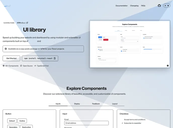
Modular and extensible React UI components powered by Radix UI, Tailwind CSS, and Tailwind Variants.
This article is about Twistail, a modular and extensible React components library powered by Tailwind CSS, React Aria, and React Stately. The author expresses gratitude to contributors and recognizes the value of open-source projects in the community. The article also mentions two projects that inspired the development of Twistail: React Icons and Tremor. The project is open-sourced and licensed under the MIT license.
To install Twistail, follow these steps:
git clone https://github.com/username/twistail.git
npm install
npm start
http://localhost:3000.Twistail is a modular and extensible React components library that leverages Tailwind CSS, React Aria, and React Stately. Inspired by React Icons and Tremor, the library provides a range of components for building user interfaces. Twistail is open-source and licensed under the MIT license, with credits given to contributors. Developers can contribute to the project on GitHub and show support through GitHub sponsors.