Tailwind react aria components starter kits
The React Aria Components Tailwind Starter is a fantastic resource for developers looking to create a tailored design system in their projects. It combines the accessibility features of React Aria with the utility-first approach of Tailwind CSS, allowing users to build visually appealing and highly functional interfaces efficiently. This starter pack is perfect for those who have a vision for their UI design but want to save time on component development.
What sets this project apart is its focus on providing styled components that can be easily integrated into existing applications. By leveraging this starter, developers can focus more on customizing their applications rather than reinventing the wheel. It’s not just a component library; it’s an invitation to create a unique design experience.
Styled Components: Offers a collection of pre-styled React Aria components that can be directly copied into your project, saving time on the design process.
Accessibility Focus: Built on React Aria, ensuring that all components are developed with accessibility in mind, making your applications usable for everyone.
Tailwind CSS Integration: Seamlessly integrates with Tailwind CSS, allowing developers to utilize its utility classes for responsive designs.
Customization Ready: Encourages customization of components, enabling developers to modify styles and functionality to fit their specific design needs.
Easy Setup: Simple installation process involving Tailwind CSS setup and dependency installation, making it accessible for developers of all levels.
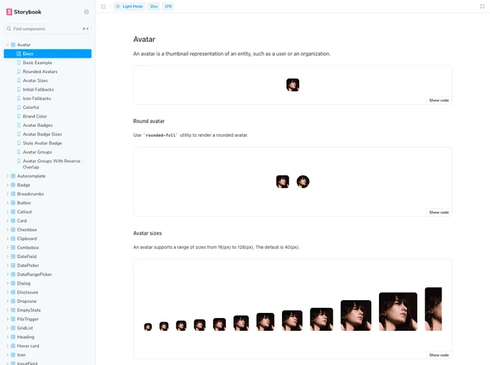
Storybook Exploration: Includes a storybook page to explore all available components interactively, making it easier to visualize and implement components in your project.
Community Inspired: Heavily inspired by established projects like the Tailwind Catalyst and Shadcn/uifluxui, drawing from successful practices in the developer community.